

To achieve compliance with the new Title II regulations under the ADA, all small text, large text, and designs in PDF files must meet minimal color contrast guidelines.
With over 50 success criteria for every government website, app, and PDF, achieving Title II compliance under the ADA is a difficult and frustrating challenge for cities, counties, and government agencies across the United States. Especially for those who produce a lot of PDFs on a regular basis.
Curious how other government agencies actually manage Title II ADA compliance for their PDFs?AccessAbility Officer provides Accessibility Management to municipalities and government agencies across the United States, ensuring digital accessibility and Title II compliance for websites, mobile apps, and PDFs used by over 35 million residents from New York to California.
Upskilling teams and enabling government to be Title II compliant under the ADA is core to our business model. Here’s how to use color contrast to improve accessibility, usability, and readability of your PDFs for residents with disabilities.
How to Ensure Color Contrast Meets Readability Standards
How to Ensure Color Contrast Meets Readability Standards
Open the PDF in Adobe Acrobat Pro DC
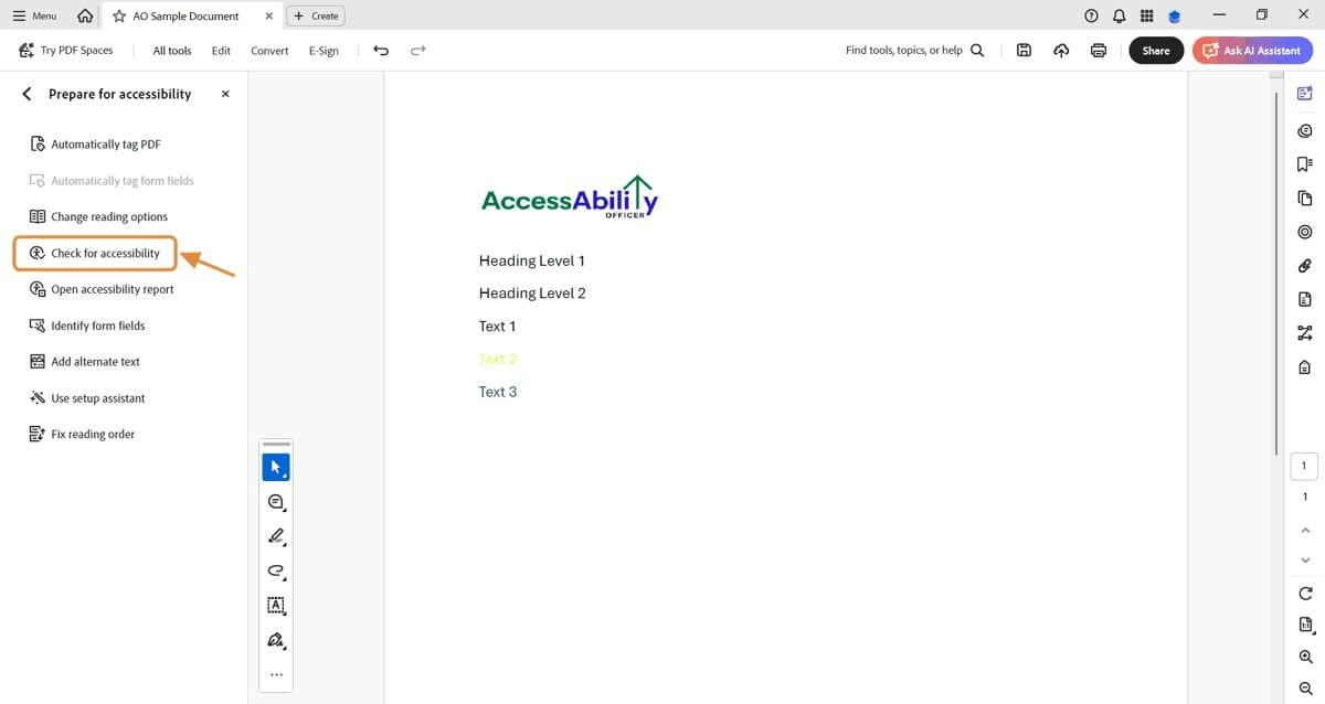
In the left-hand pane or top menu, click on All Tools.

Find “Prepare for Accessibility”
Scroll through the tools list or use the search bar to locate Prepare for Accessibility.
Select "Prepare for Accessibility" and then “Check for accessibility.”

Click “Start Checking” in the Accessibility Checker Options pop-up modal
When the Accessibility Checker Options window appears, under Document, look for " Contrast (Minimum).”
Then select Start Checking.
If issues are found, Acrobat will list them in the report.
Review the Results for “Contrast (Minimum)”
In the results panel, look under Document → Contrast (Minimum).
If issues are found, they will be listed in the report. Review each flagged element. If needed, adjust colors in the source file.
AccessAbility Pro Tip: Adobe’s checker may not catch all contrast issues, especially those within images. So, you need to review those manually to ensure ADA compliance.

Use the Color Contrast Analyzer and Test
Color Contrast Analyzer will help you test the foreground (the text) and the background colors to ensure they meet minimal contrast ratios for ADA compliance.
Note that contrast ratios are greater for normal sized text than for large text. Because of its size, smaller “normal” text is harder to read, therefore the contrast ratio is greater.
The contrast ratio for normal text is 4.5:1
The contrast ratio for large text is 3:1.
Text is considered “large” if it is 18pt or larger. However, if the text is bolded, it is considered “large” at 14pt.

Download the free Color Contrast Analyzer (CCA) for Windows or Mac.
How Do City and State Governments Comply with Title II Under the ADA for PDFs?
Whether it’s PDF accessibility or web accessibility, there are 2 paths for municipalities and state agencies to take.
- Nail down the fundamentals and best-practices. Then update your processes, systems and technology to scale PDF accessibility internally.
Nail down your accessibility fundamentals and best-practices with PDF Accessibility Simplified: Phase 1 Accessibility Fundamentals - Take Title II ADA Compliance off your plate. With ADA, legal, and technical experts on staff, AccessAbility Officer is the trusted partner for the same Title II compliance problems and deadlines faced by other government agencies just like you.
Explore working with real Title II compliance experts at scale.
AccessAbility Officer
Ability Is Our Middle Name!